1. Critique of Data Visualization
1.1 Clarity
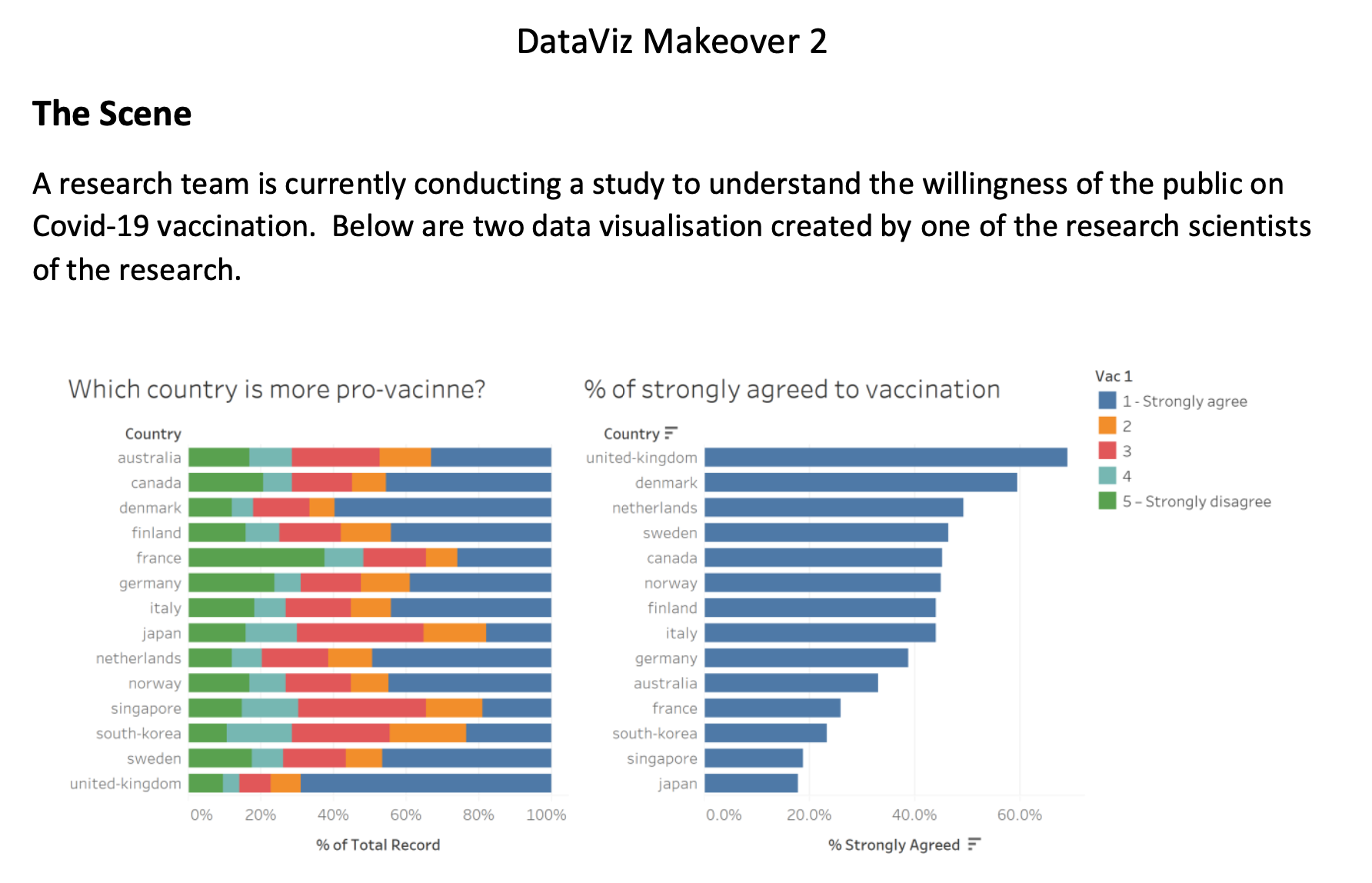
Apart from Strongly Agree and Strongly Disagree, the other three categories are not expressed the meaning, so accurate information from the legend cannot be obtained.
As 100% stacked bar chart, it is not clear how much support each country has for vaccines, comparing the middle three categories among those countries are difficult.
Reading the percentage value of strongly disagree is difficult. Also reading the percentage value of the sum of strongly disagree and category 4 is difficult
The bar chart on the right is clear and easy to understand, also it is sorted for the audience to read. However, it could be improve by using uncertainty
1.2 Aesthetic
The distribution of the colors is not consistent enough. Strongly Agree/Strongly Agree should be used more brighten color.
Legend on the right top corner is vague.
It is not a excellent data visualization since I want to compare different country’s opinion on pro-vaccine. So I believe it is better to change to diverging stacked bar chart in the view of comparison.
The initial letter of country name is in lower case in both chart, which is not professional.
Color scale can be better chosen to reflect ordinal data type, which color scale can be more efficiently used.
There is a typo in Chart 1 title, as vaccine is mis-spelling as “vacinne”
Way to Improve Current Design
1.3 Improve from Clarity
Add “2”, “3”, and “4” can be modified to “2 – Agree”, “3 – Neutral”, and “4 – Disagree” at the right legend to convenient the audience to understand
Diverging stacked bar chart is more suitable with the comparison by showing the negative percentge reperesent the strongly disagree and disagree.
When drawing many samples from a population, it is possible to obtain a few with means that greatly differ from the population. So we can use uncertainy by adding standard error for the bar chart in the right side.
For greater clarity, the exact survey question will be stated in the visualization so that the user is able to know exactly what is the question of vac_1.
1.4 Improve from Aesthetics
Instead of using 5 separate colors, we can use a more distinct color such as gradient from red to dark blue.
It is recommended to use diverging stacked bar chart and create Gantt Percent, which can represent the each category with better data visualization.
Change the initial letter of country name in upper case.
Change the typo by its correct form “vaccine”
2 Sketch of Proposed Design
2.1 Sketch
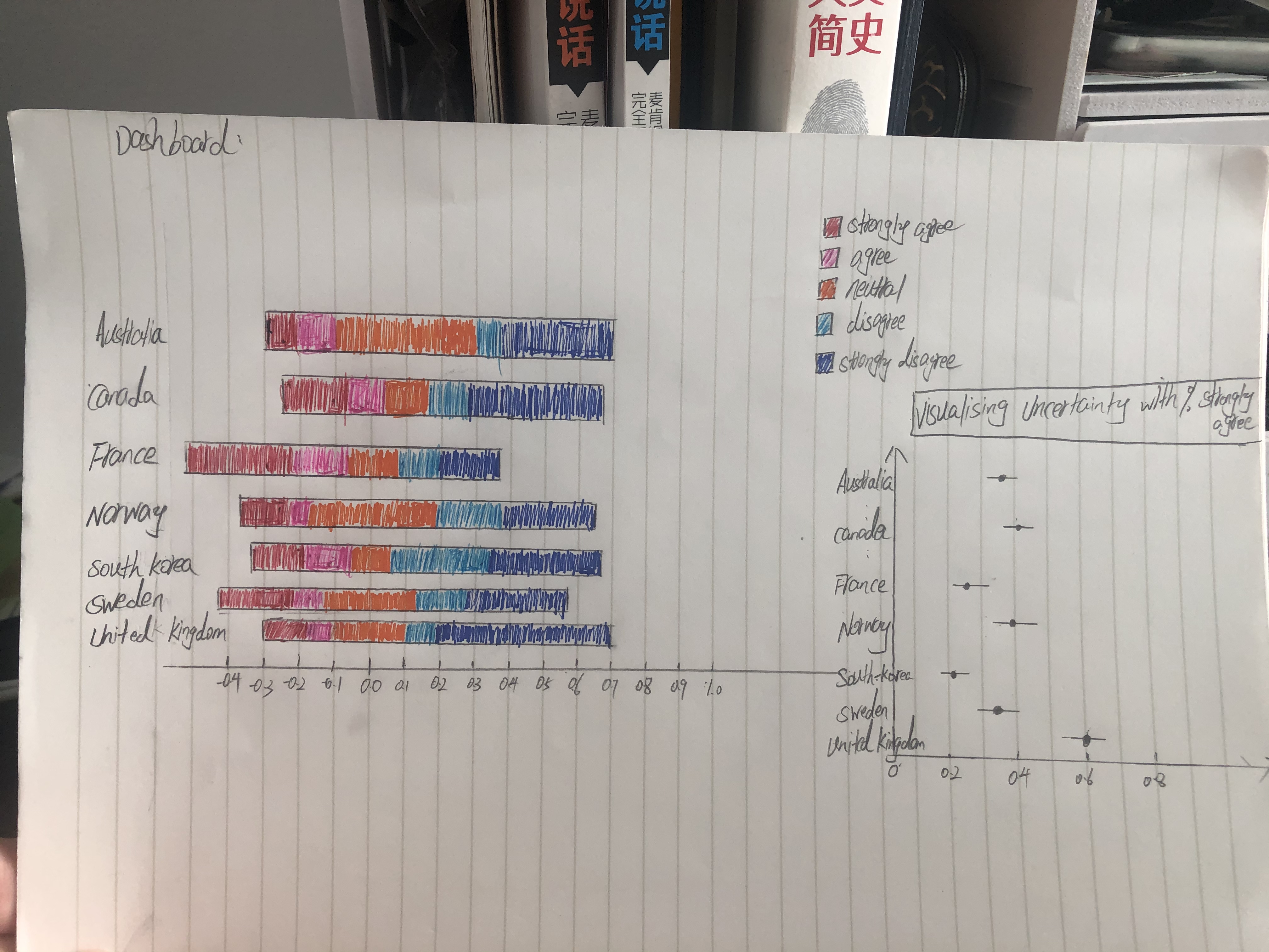
2.2 Advantages of Propose Design
Please view the visualization on Tableau Public
We can clearly see from the figure that United Kingdom is on the far right, indicating strong opposition to vaccines. This is the advantage of Diverging Stack Bar Chart to view each segment of opinion with Likert Scale data. Also, I added a clear legend to make the audience easy to visualize the chart. The progression of colors also has a visual effect, such as strong agree is red and agree is pink.
The standard deviation and standard error are two important characteristic of the population. It tells us how much spread there is among individual observations we could make.So when we applied the uncertainty to the dot plot with the population data. It is a more appropriate and precise way to present the data visualization. And we can clear see the range from confidence interval within 95%.
3 Step -by-step Description on Data Visualization Design Process
3.1.1 Data Preparetion for Diverging Stacked Bar Chart
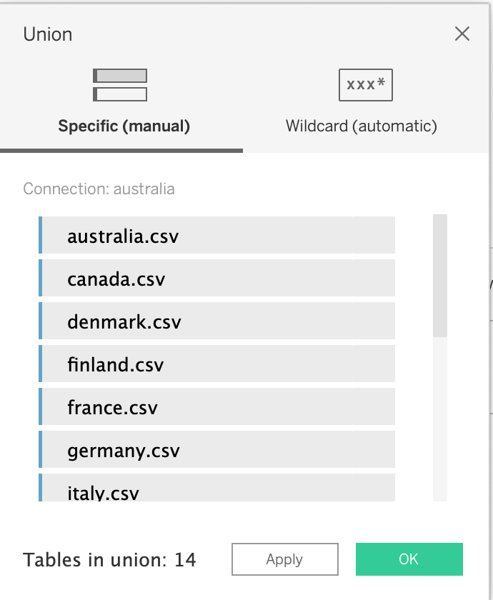
- Import Data into Tableau and union all the data
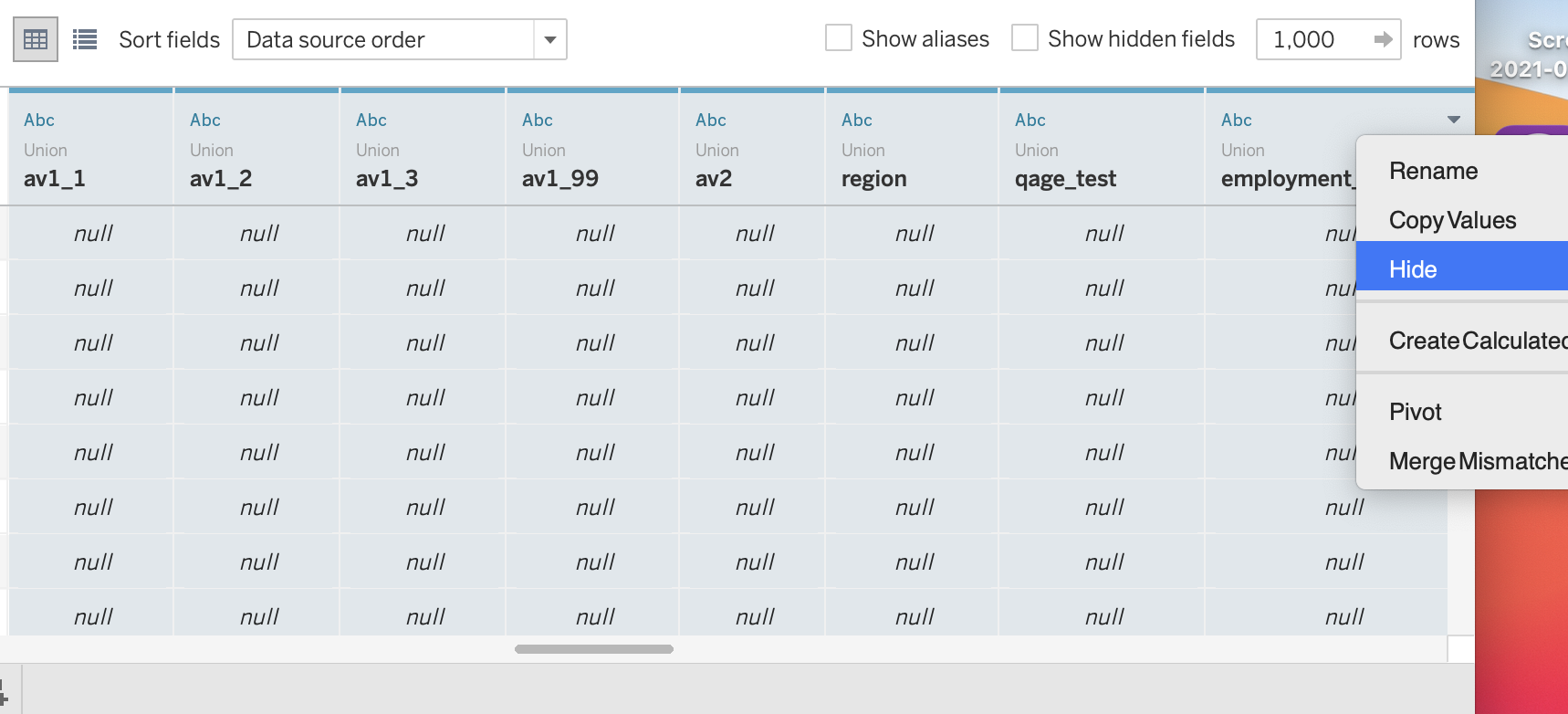
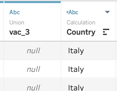
- View the column and hide redundant column
- Split [Table Name] and render the column name as [country]
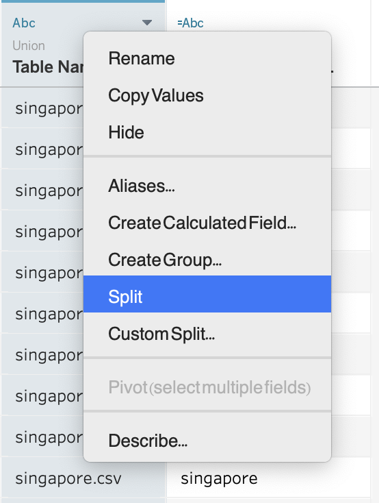
Tableau can help us break up the whole column with ’ . ’
Now we get the clean country column.
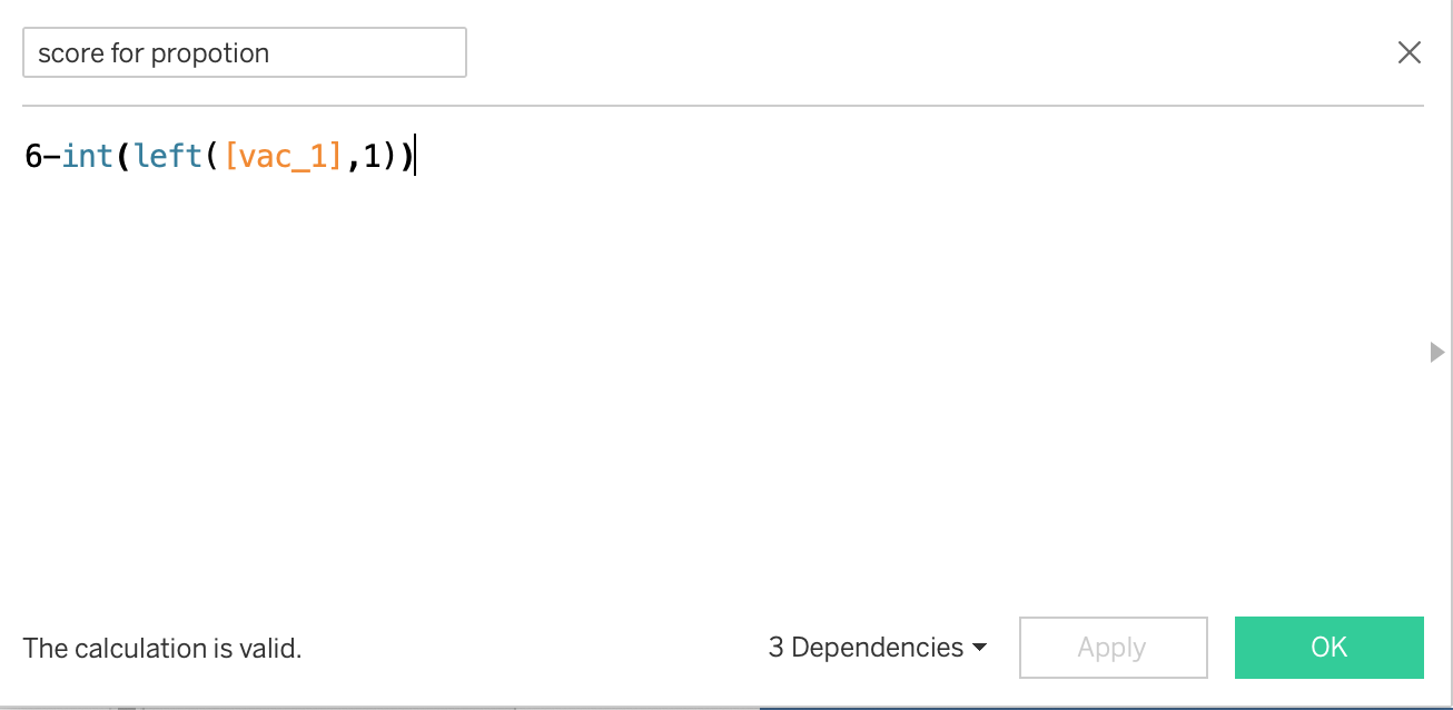
- Use Create Calculated Field to redefine [vac_1]
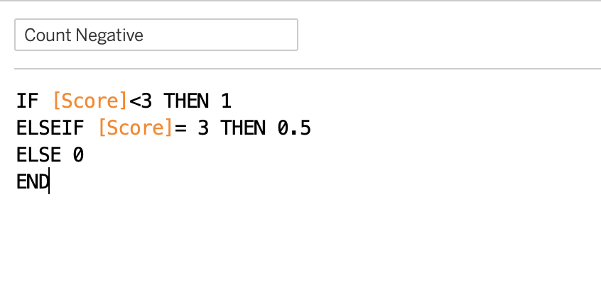
When creating score column, I changed Strongly Agree to the lowest value, 1, and then increased it to the highest value, 5. The purpose is to present strongly disagree and disagree in the negative region
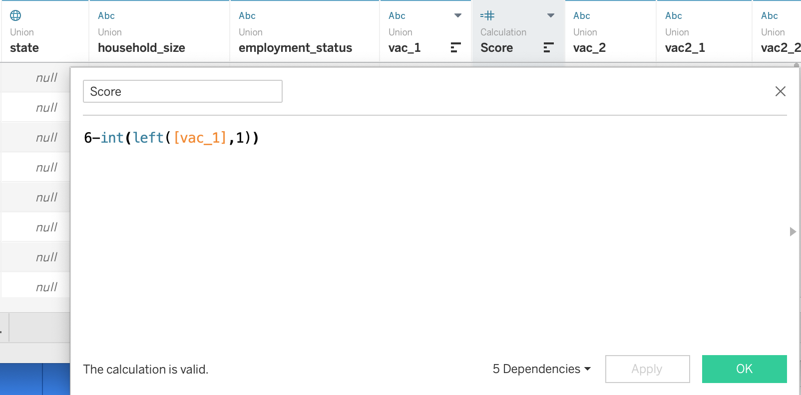
Formula is 6-int(left([vac_1],1)). The reason for using this formula is that I want strong disagreement and agreement to be shown as negative axis in the diverging stacked bar
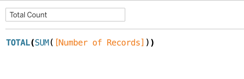
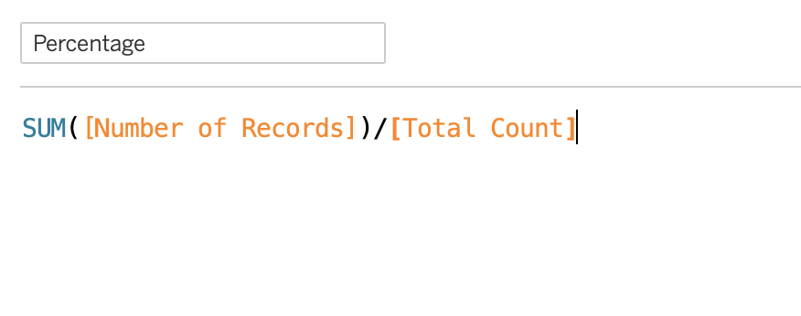
- Create Number of record, Total count and Percentage column
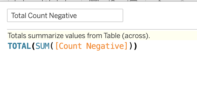
- Create Total count negative, Total count and Gantt Start column
- Create Gantt Percentage
Explanation :ZN(expression) returns the expression if it is not null, otherwise returns zero. Use this function to use zero values instead of null values.
3.1.2 Data Visualization for Diverging Stacked Bar Chart
- Change score into dimension
- Aliases Score and Country Column
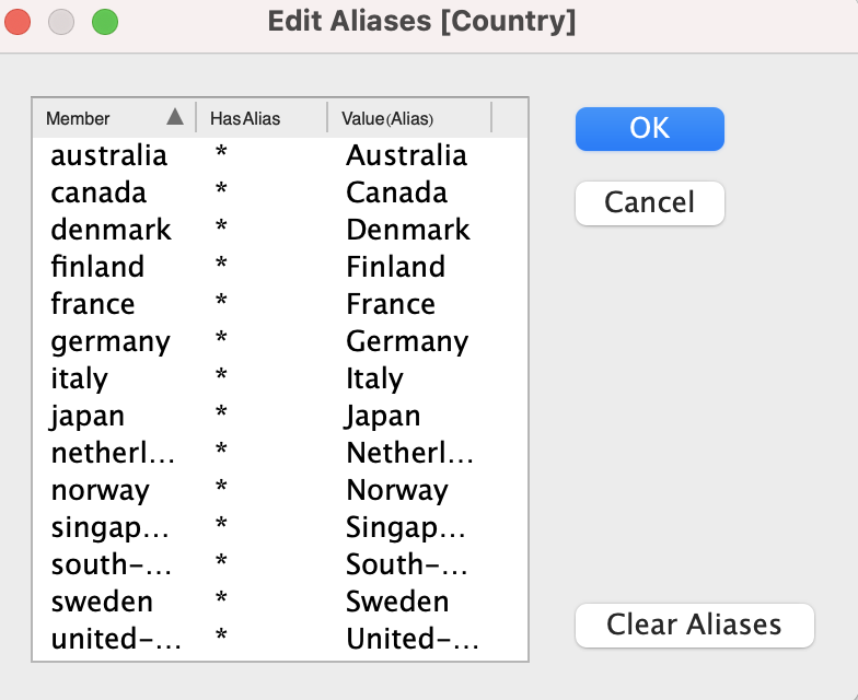
Now we can see that in this score column 1 stands for Strongly Disagree and 2 stands for Agree. At the same time, we revised the first capital letter of each country, which make it looks more formal.
3.Drag score to Fliters, Grand Percentage to Column and country to Row
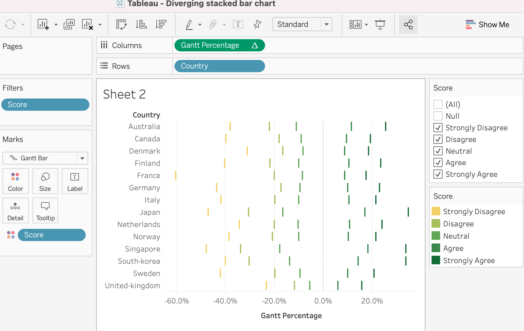
At the same time of this step, we set Chart as Gantt Bar.
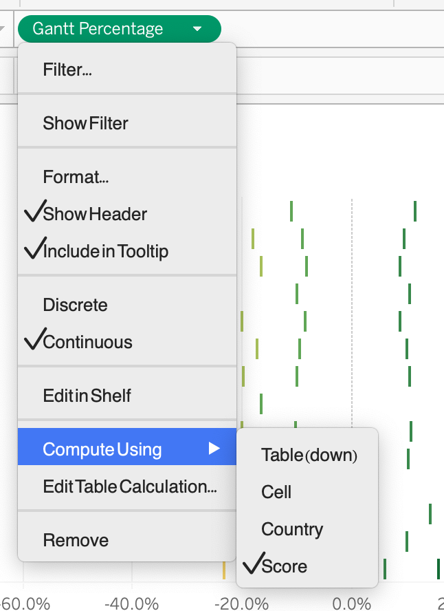
4.Drag Percentage to Size and Country to Detail
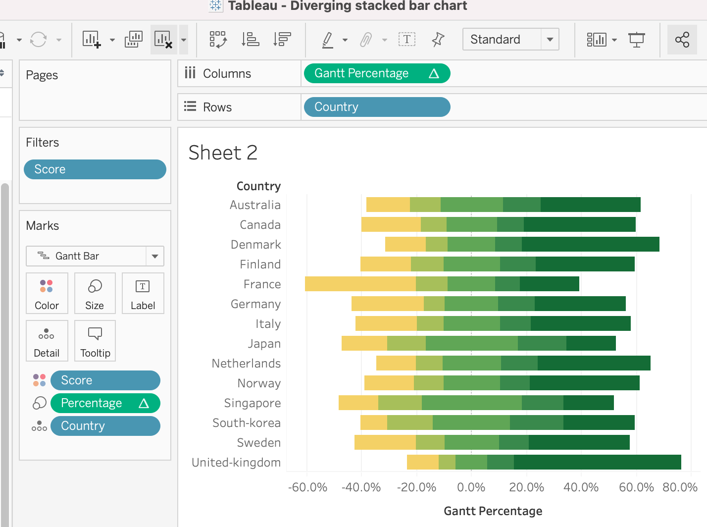
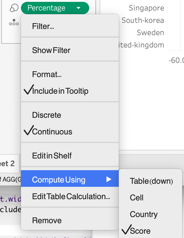
While we are doing this, we set up the colors and choose an appropriate theme for color.
- Add household size, gender and employment status to dig insight information
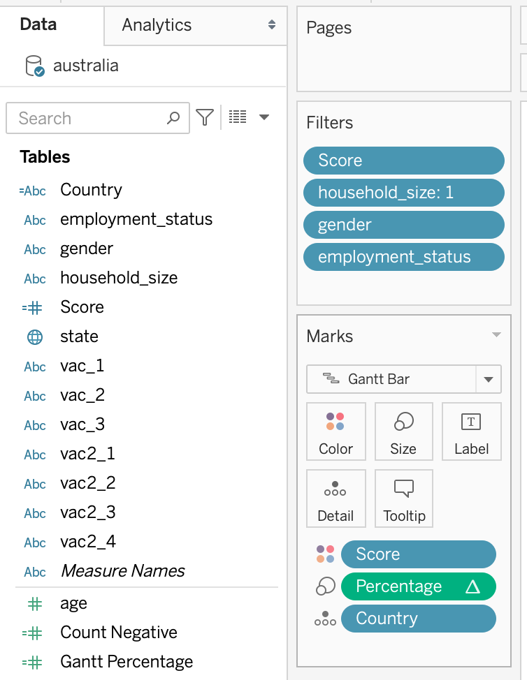
Finally, it was found that household size had an obvious impact on attitudes towards vaccines,so we retained this Filters.
3.2.1 Data Preparation for Uncertainty Bar Chart
- Creating Calculated Fields and Parameters
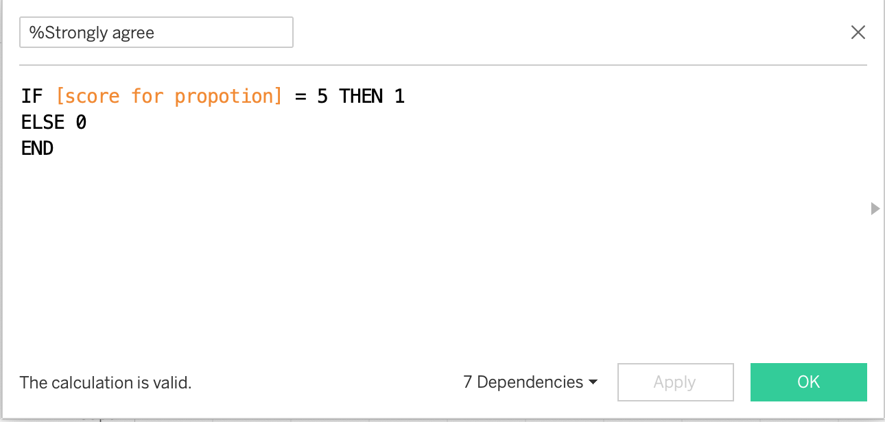
- Create a new worksheet and rename it as ‘Uncertainty Chart’. The first step would be to create the necessary calculated fields and parameters. And I create a new score proportion to use to count the number of strongly disagree
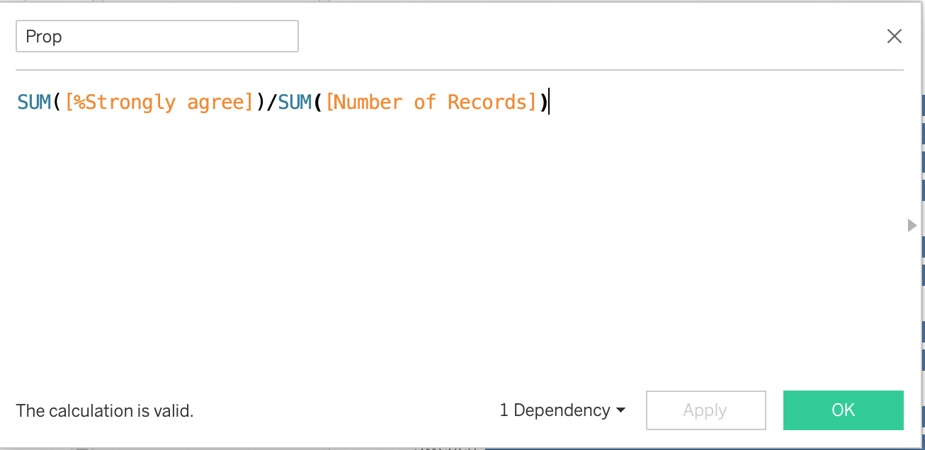
- Creating a calculated field for Prop: proportion is generate by using the sum number of strongly agree divide by the sum number of total
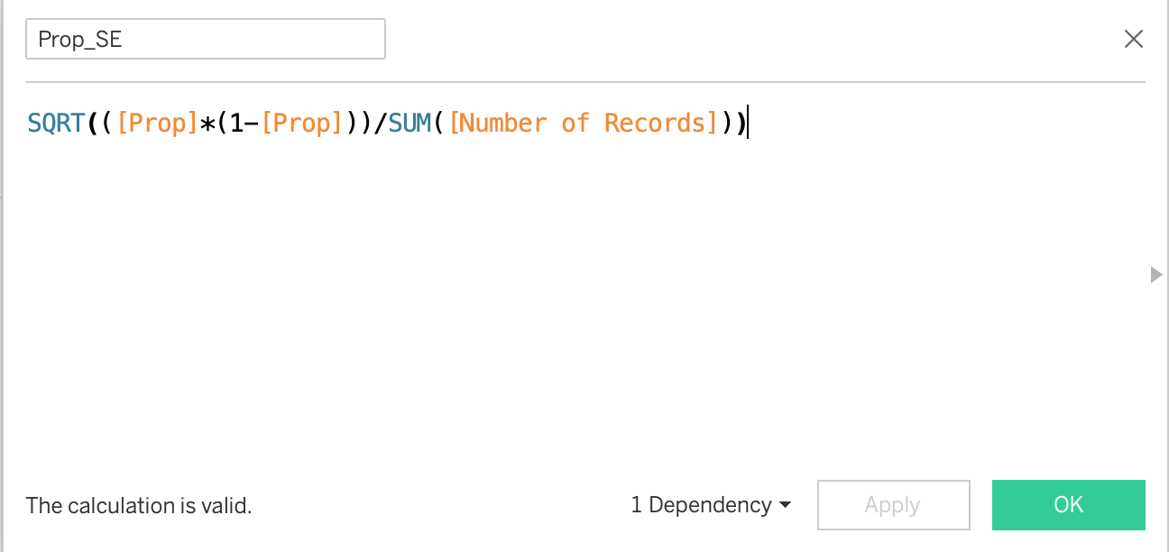
- Creating a calculated field for Prop_SE: standard error is calculate by proportion multiplied by (1 - proportion). Then this number divided by the sum of the number of records. In the end, using square root for the calculated number.
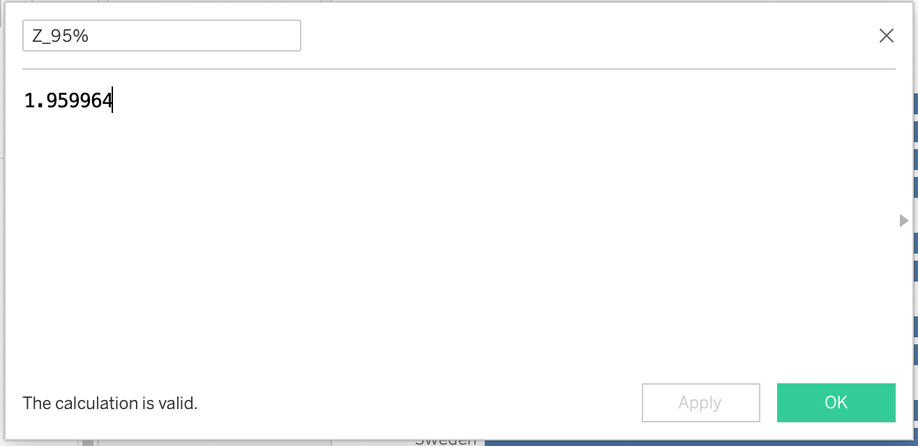
- Creating a calculated field for Z_95%: Z = 1.959964
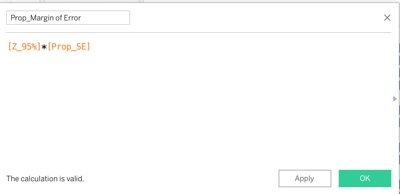
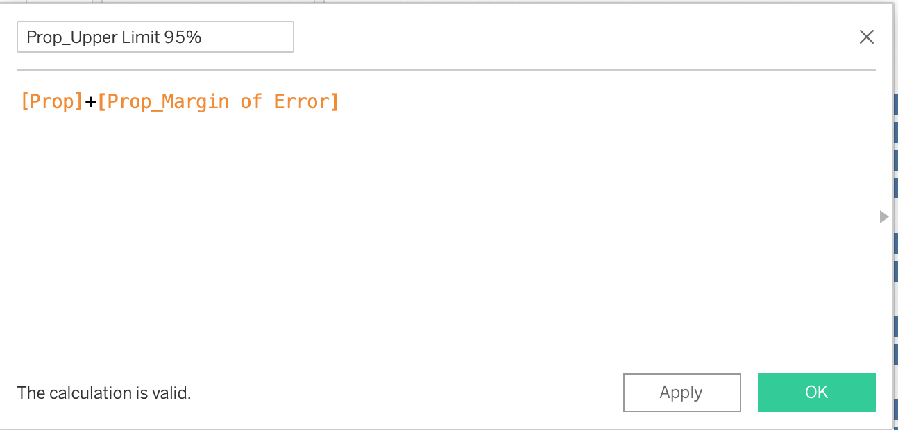
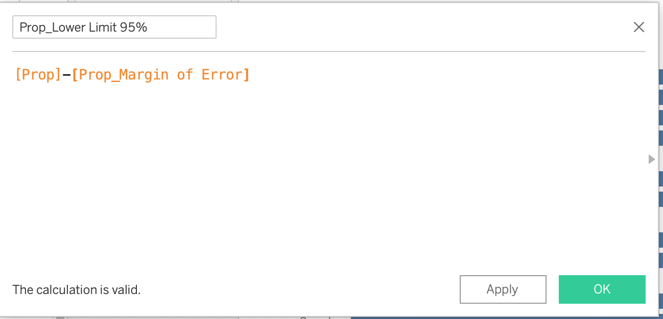
- Creating a calculated field for Prop_Margin of Error: Formula for margin of error is the Z_95% multiplied by the standard error.
- Creating a calculated field for Prop_Upper Limit 95% and Prop_lower Limit 95%
3.2.2 Data Visualization for Error bar on a Dot Plot
1.Add score to filter to exclude NULL variable
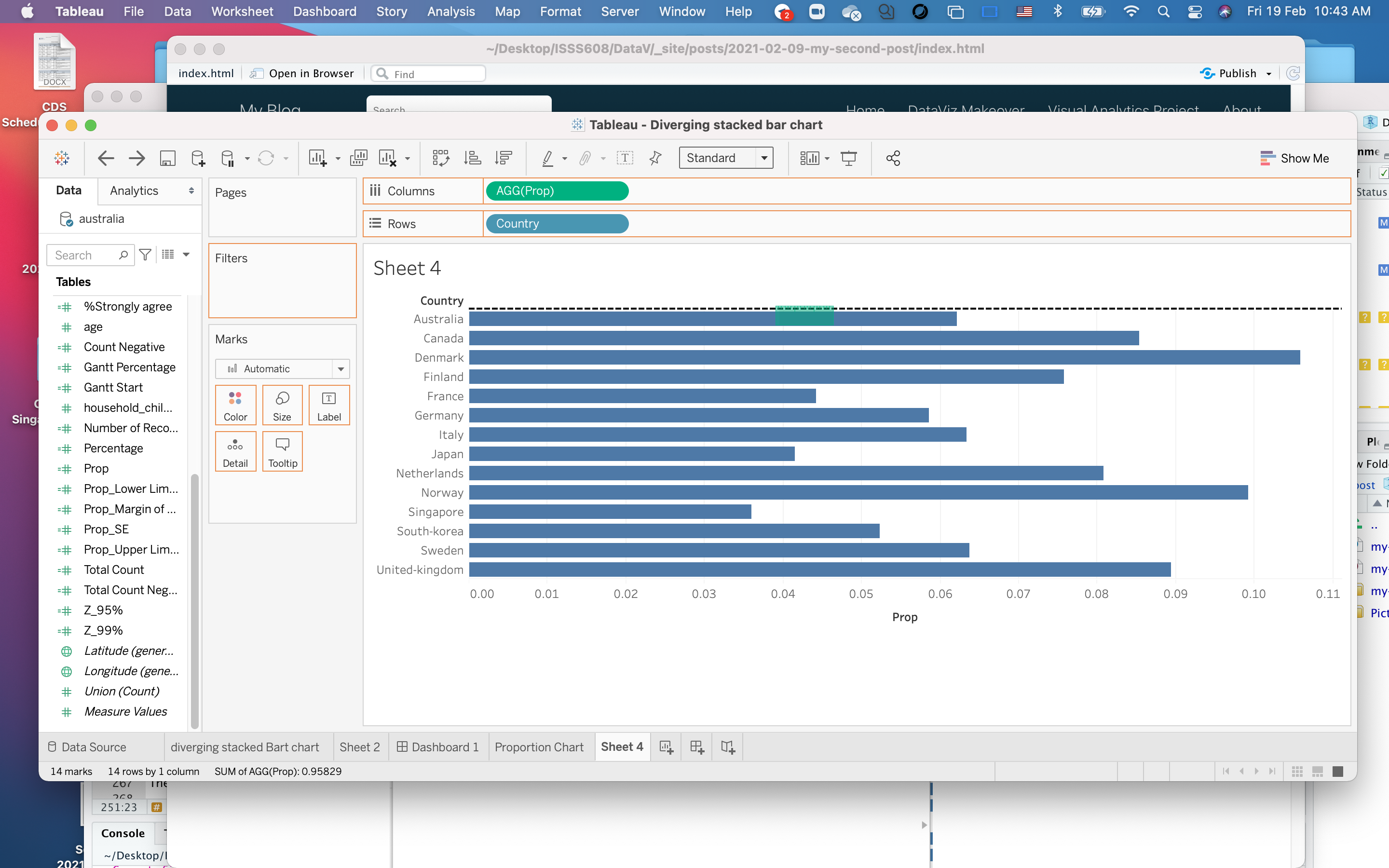
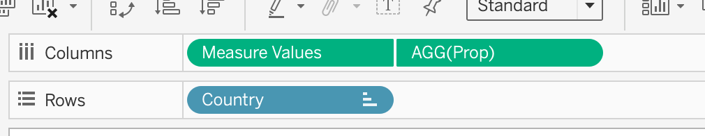
2.Prop is added to Columns and Country is added to Rows
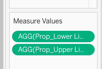
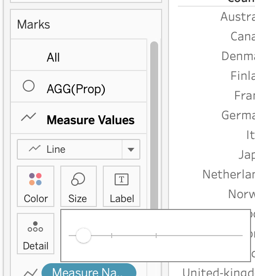
- Add measure value to the black above country.Then Measure Values is added to columns. The next step is , remove all items except for AGG(Prop_Lower Limit 95%) and AGG(Prop_Upper Limit 95%) under the Measure Values pane.
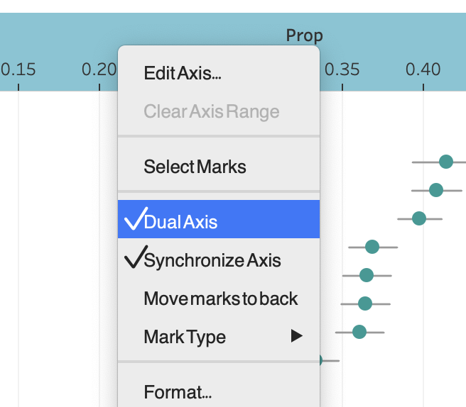
- Move the Measure Value in front of Prop. Then click on the down arrow on Measure Values and select dual axis.
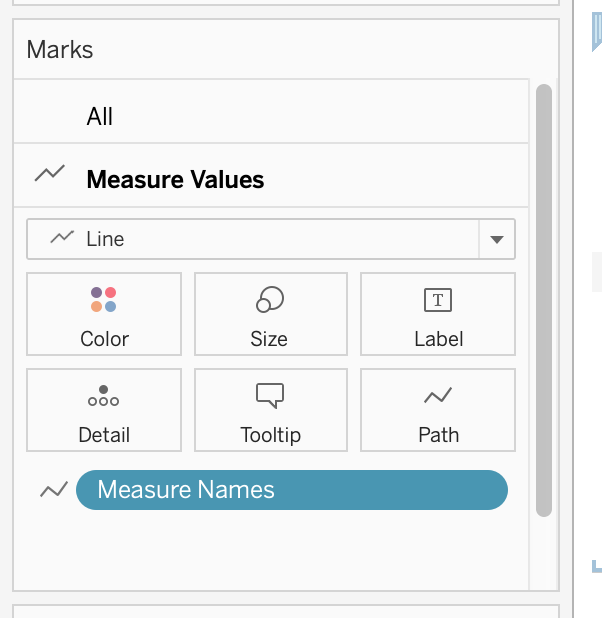
- Change the Measure Values in the mark section into chart, and drag Measure Name in the the icon path
Dashboard
1.Add title:
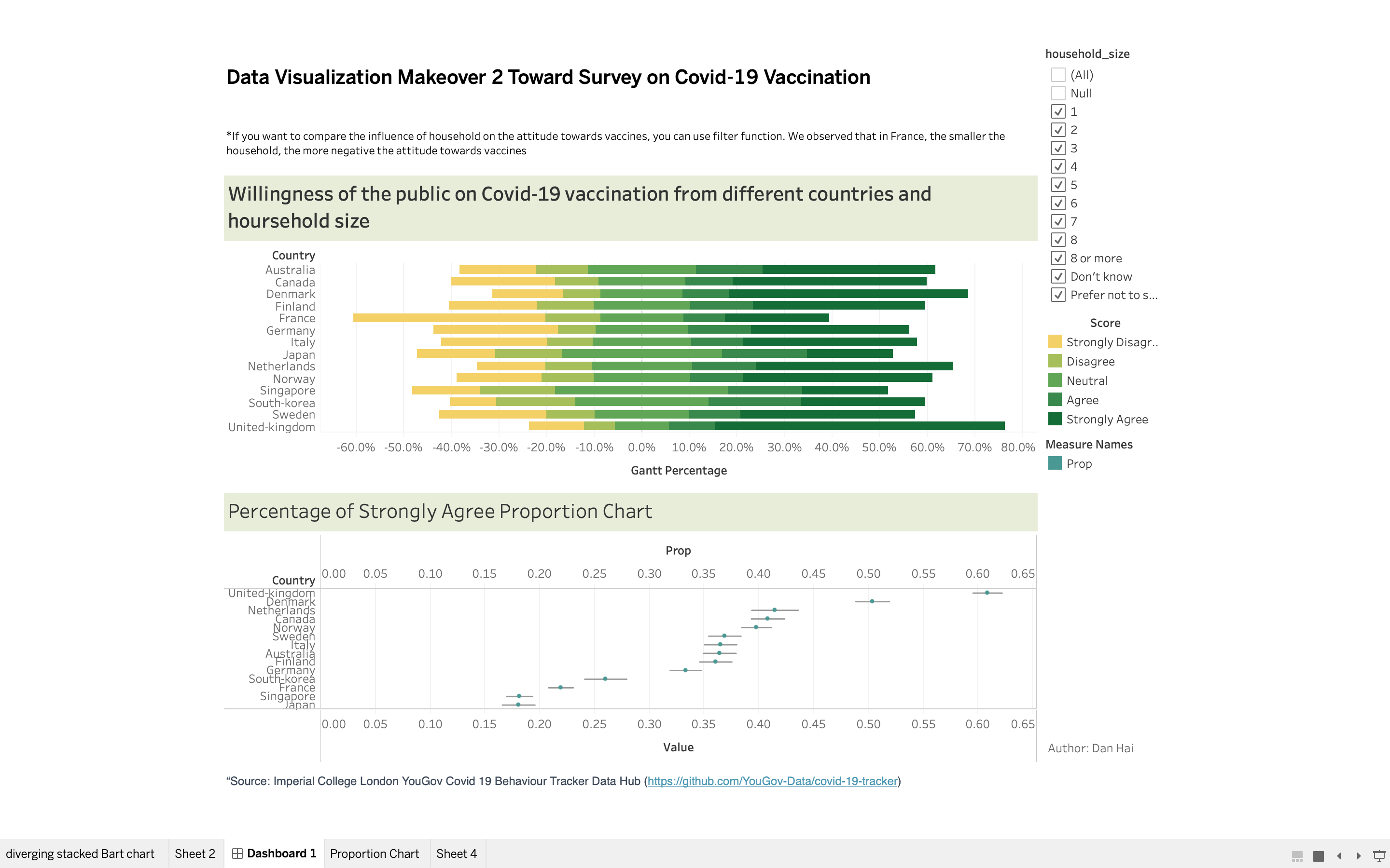
First graph add title : “Willingness of the public on Covid-19 vaccination from different countries and household size” with green background
Second graph add title : “Percentage of Strongly Agree with 95% CI” with green background
2.Add commentary:
On the top and add text: “If you want to compare the influence of household on the attitude towards vaccines, you can use filter function. We observed that in France, the smaller the household, the more negative the attitude towards vaccines”
3.Add source:
Using Objects > Text > drag to bottom left and add : ““Source: Imperial College London YouGov Covid 19 Behaviour Tracker Data Hub (https://github.com/YouGov-Data/covid-19-tracker)”
4.Add author:
Add text to bottom right corner and add text : “Author: Dan Hai”.
4. Final Visualization
4.1 Snapshot of Dashboard
4.2 Main observations
As can be seen from diverging stacked bar chart, compared with other countries, the percentage of French people who strongly agree is the highest.
Also in the stacked bar chart, it can be seen that the United Kingdom has the highest degree of acceptance of vaccines, because the bar chart is on the far right, and the proportion of strongly agree is also the highest, followed by Denmark
As can be seen from the second Proportion chart, the United Kingdom has the highest degree of Strongly Agree, Japan has the lowest degree of Strongly Agree. And South Korea and Netherlands have the widest confidence interval, which are range from 24% to 27% and range from 39% to 44%.