1. Critique of Data Visualization
1.1 Clarity Issue
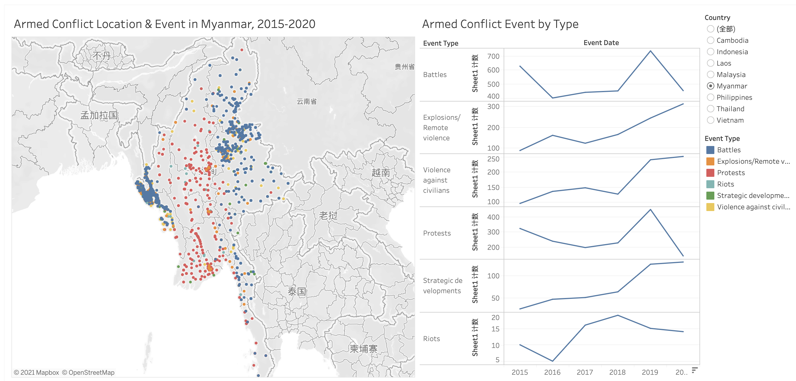
The color matching of the map ignores the problem of red-green colorblindness, which seems to be a small problem. However, there are an estimated 300 million colorblind people worldwide. We should avoid using Green color.
There is a lot of useful information in our dataset, but when we look at the information for each location, there is very little information in Tooltip.
In the line chart on the right, the range of Y-axis is different, which may easily lead to misunderstanding.
One great advantages of using line chart is to show tendency, while bar chart can better show distribution.It seems to me that the right on the right want to showcase distribution but using line chart.
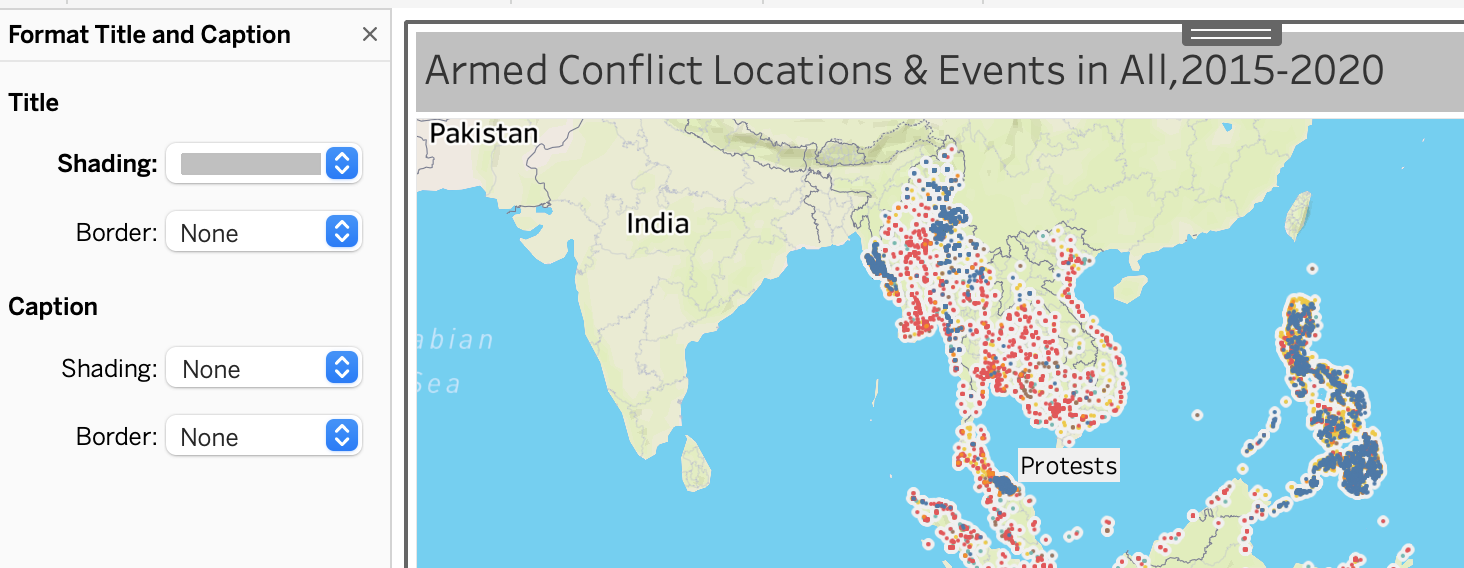
In fact, in the map on the left, if you look at it alone, you can only find distribution, and you can’t really get anything more insight. Should enrich the content with tooltip.
1.2 Aesthetic Issue
The color of the map is too dark, it is not aesthetically pleasing, we can try a different background instead.
The figure on the right looks particularly messy and does not compare trends in each column.
The colors on the right are also very monotonous. Can try to enrich a simple line chart
1.3 Improve from Clarity
- Change the green color and replace it with dark brown for easily distinct purpose.
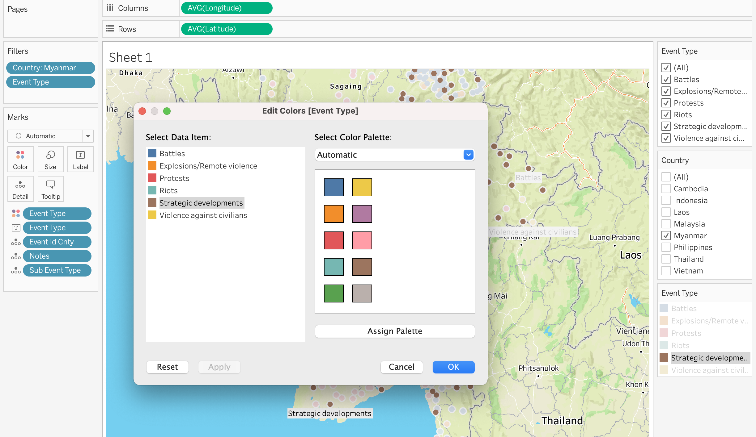
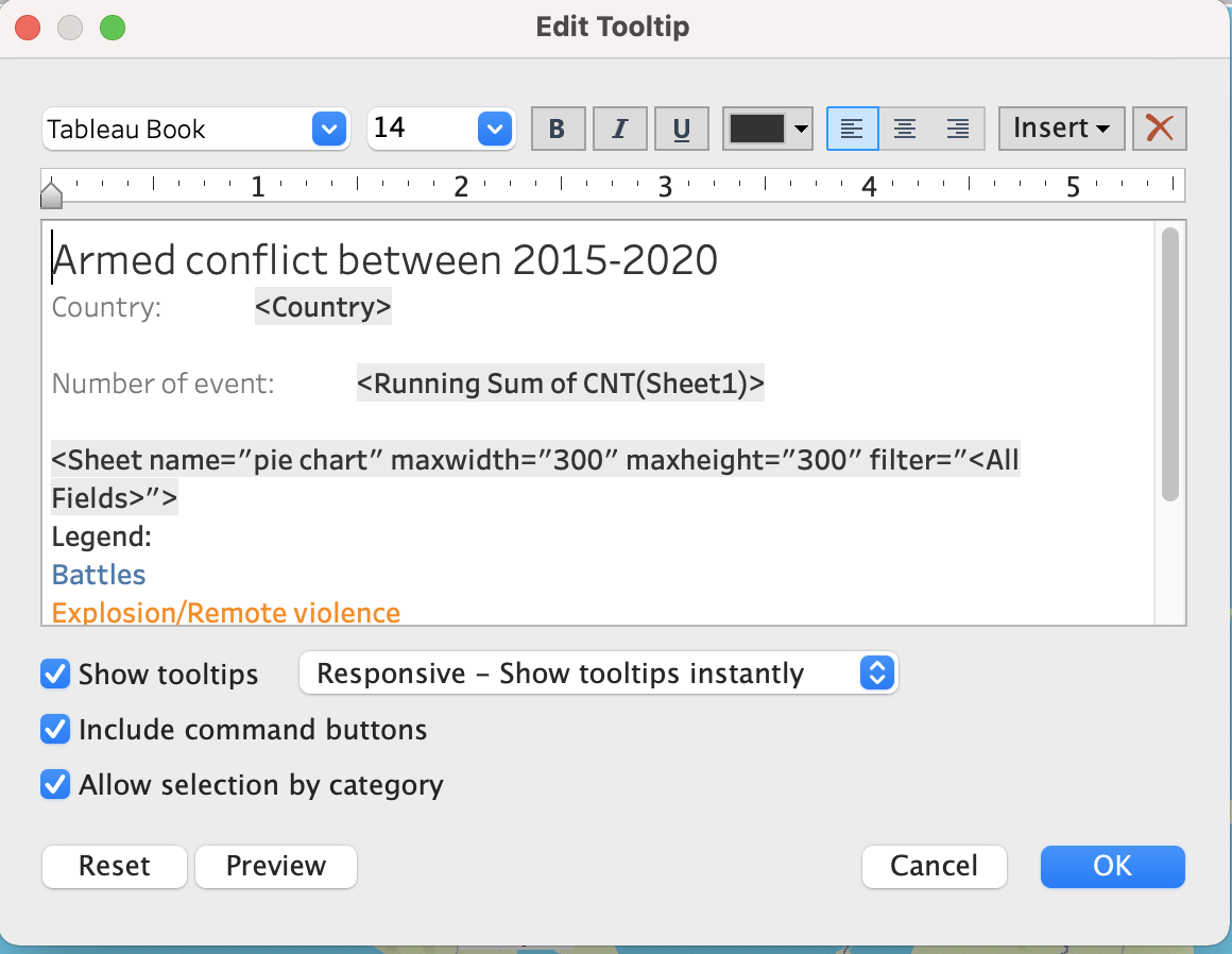
- Add notes and subtypes to tooltip so that viewers can click on each location to see more information on each conflict.
- Change the Y-axis to the same value to avoid misleading.
- A bar chart can be used to show the distribution with the Y axis as the country and the X axis as the event type
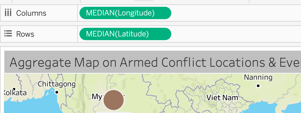
- Add a map, aggregate all the armed conflict type, and then divide them by countries. By comparing the size of the circle, the conflict degree of each country can be obtained
1.4 Improve from Aesthetics
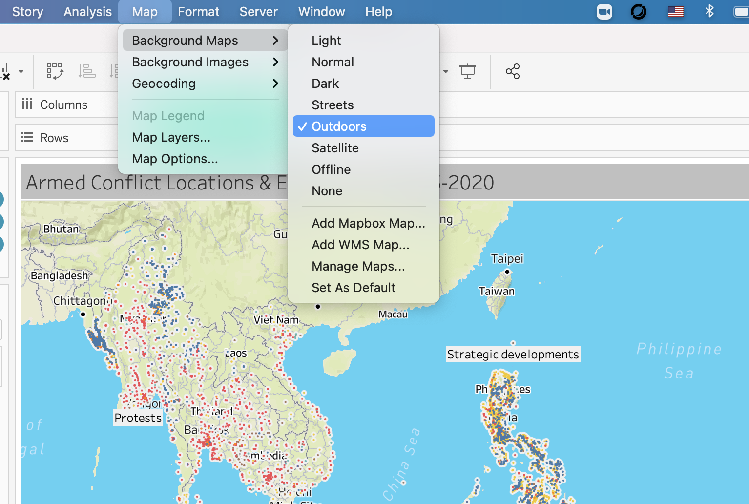
In Tableau, click Map Background Function and change it as ‘outdoors’.
Can do it in Tableau by dragging Event Type into color square box, but it is best by using bar chart instead of line chart.
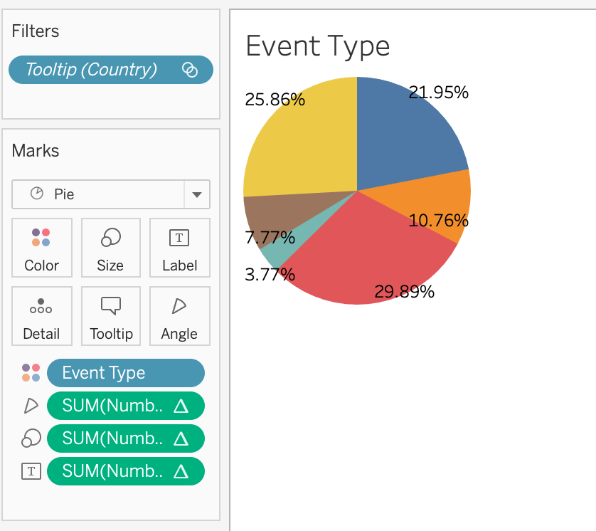
Add a pie chart to the tooltip to show the proportion of event types for each country.
2 Sketch of Proposed Design
2.1 Sketch
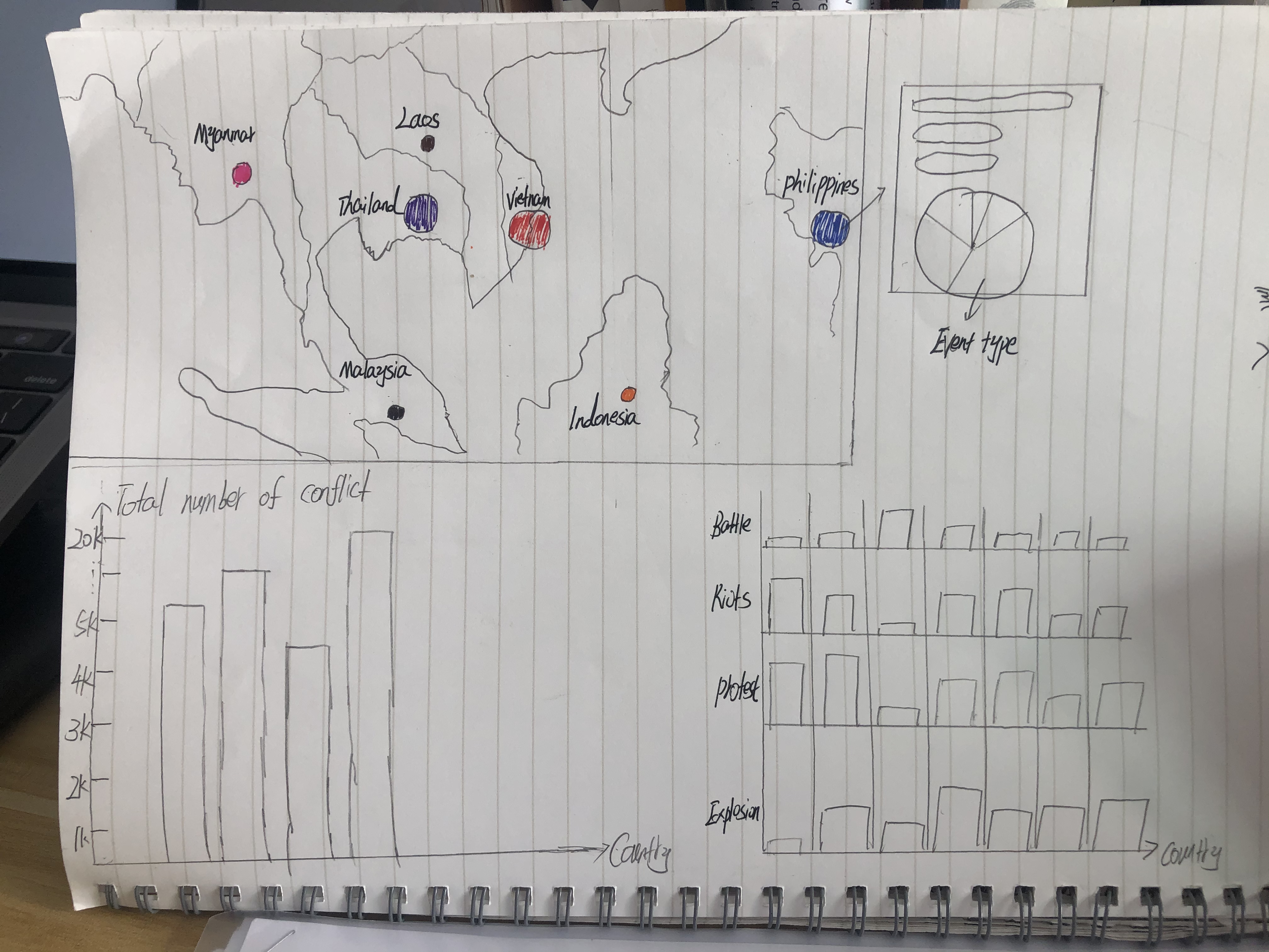
2.2 Advantages of Propose Design
Please view the visualization on Tableau Public 1 Tableau Public 2
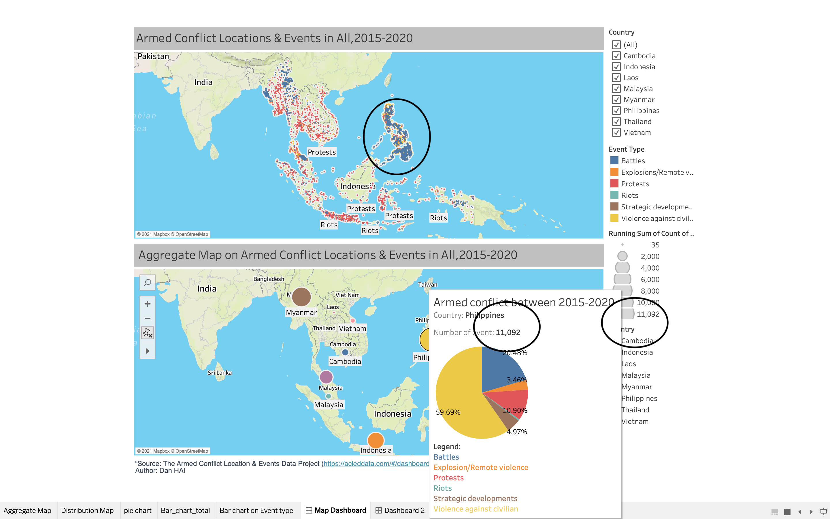
My improvement is I want to use two maps in a dashboard, the first one is the initial figure prof give to us in the assignment, I put the background into OUTDOORS and added more information in the tooltips , the second map is on the sketch above, I hope the audience can quickly know the number of national conflict. At the same time, through pie chart, detailed information about event type percentage are on the tooltips.
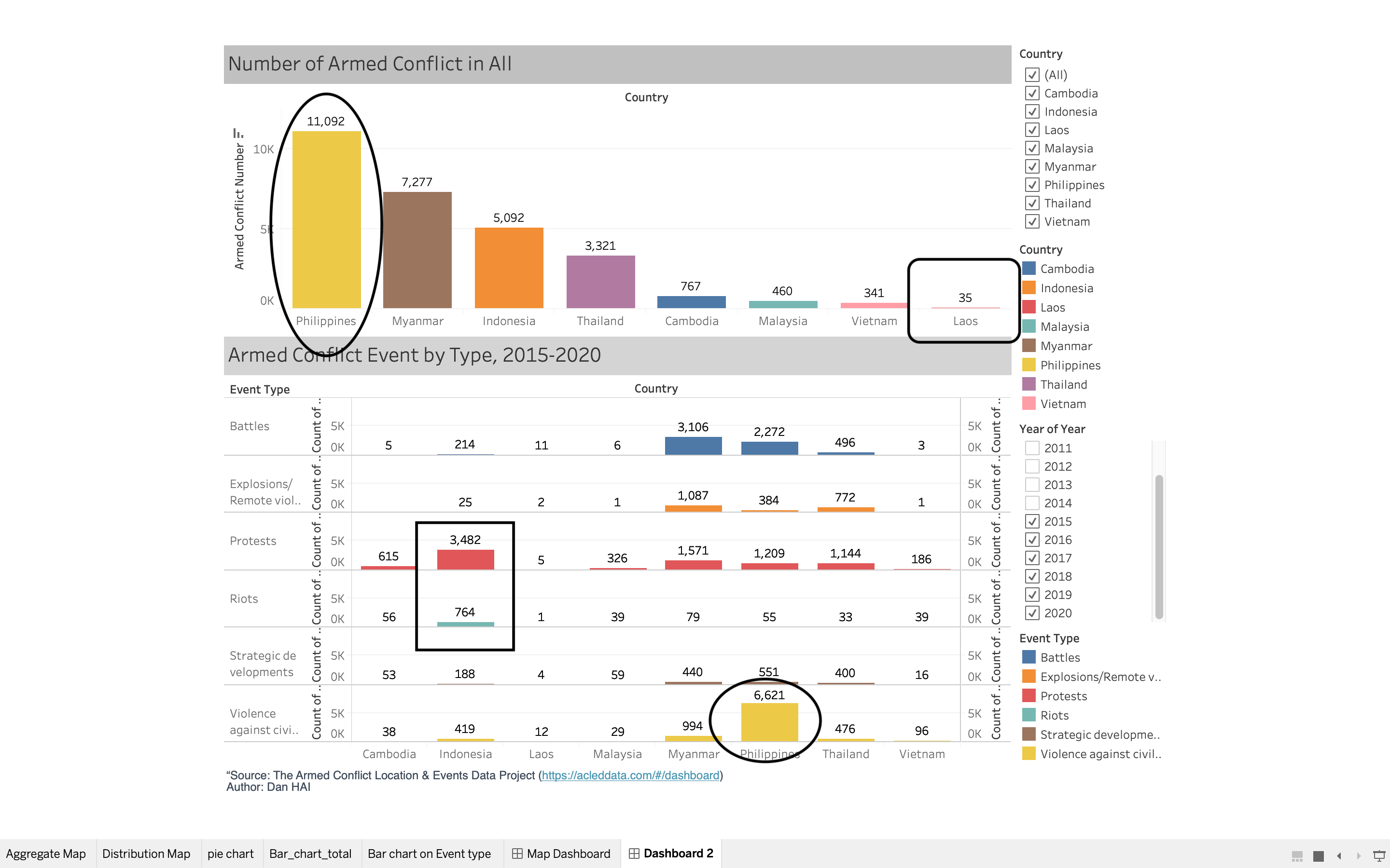
The following sketch from the bottom can also form a dashboard. The bar chart on the left shows the comparison of the total number of each country, while the bar chart on the right is refined to the comparison of each event type, which is clear and easy to understand. Meanwhile, it expresses roughly the same meaning as the first dashboard, but with different presentation modes.
3 Step -by-step Description on Data Visualization Design Process
3.1.1 Data Preparation
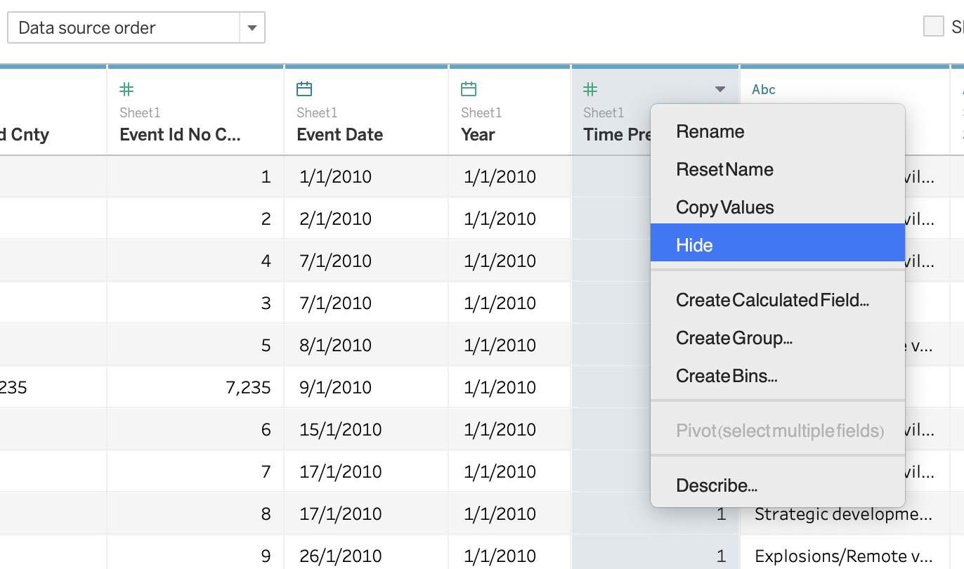
- Import Data into Tableau
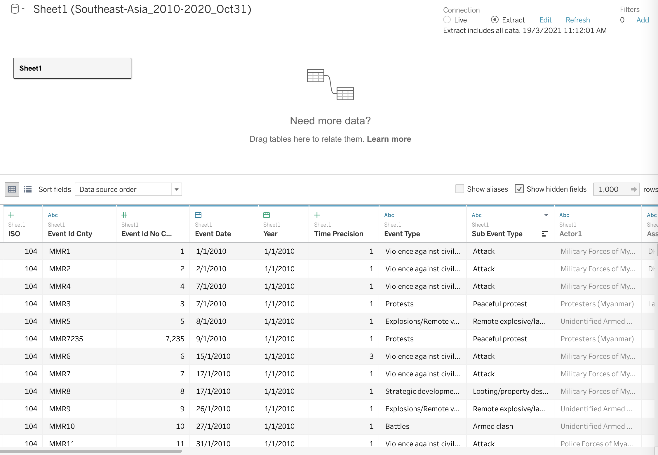
- Hide the column that we might not use
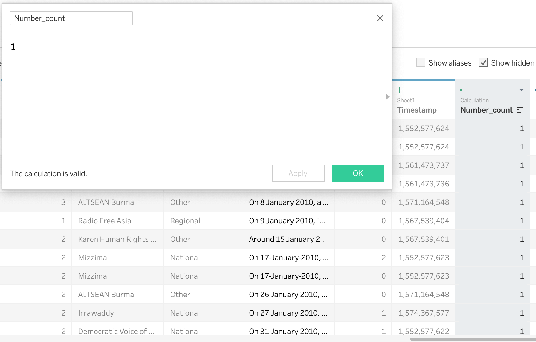
- Create new column as ‘Number count’ for later pie chart preparetion
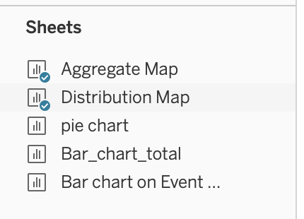
3.1.2 Data Visualization for Distribution Map Chart
- Change background into Outdoors
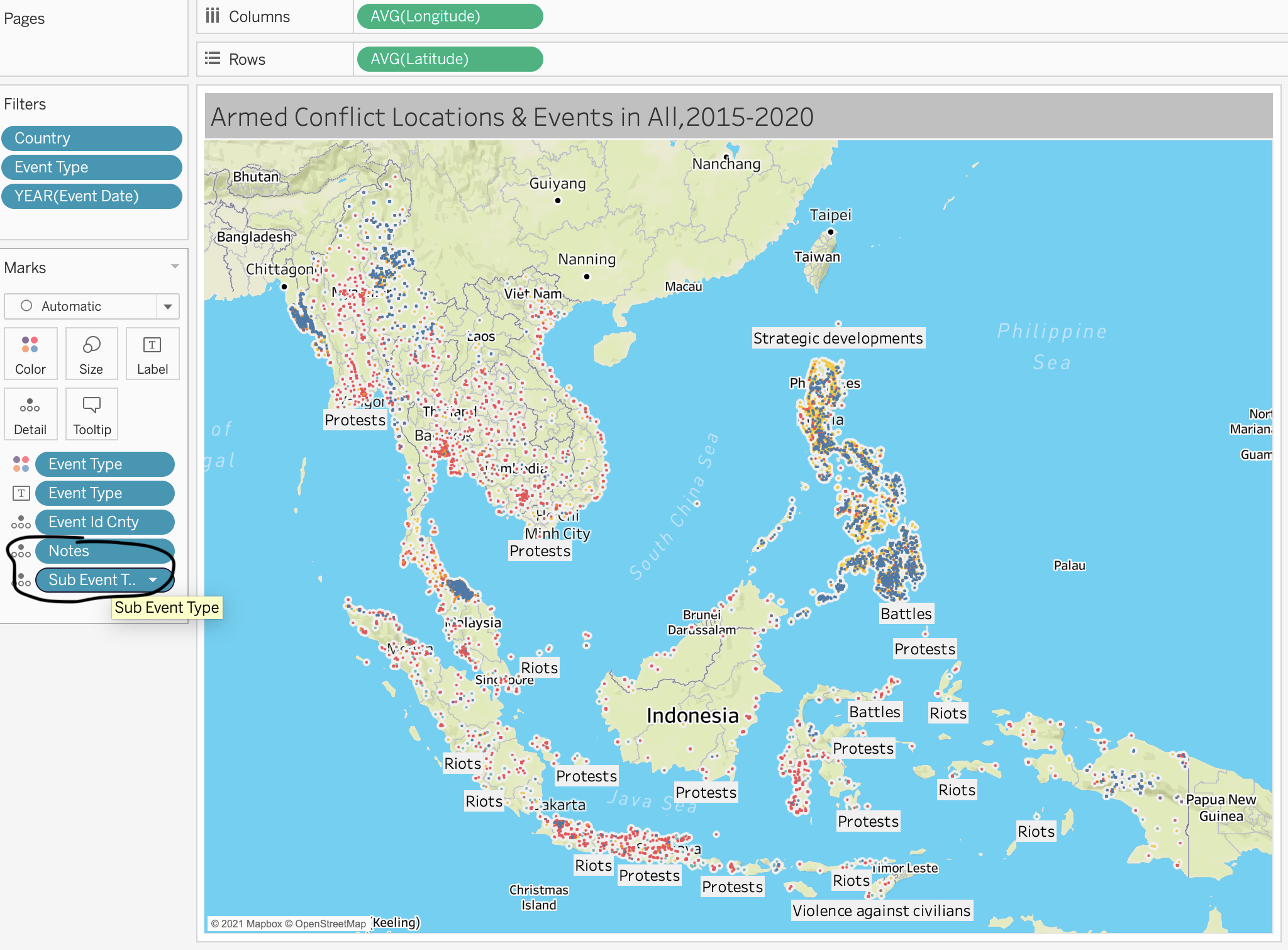
2 Add ‘Notes’ and ‘Sub Event Type’ on Detail to show more information
3 Avoid of using Green color and change the Green color into Brown on the ‘Strategic Development’ type
3.1.3 Data Visualization for Aggregate Map chart
- Drag Count into size and country into Label, country into Detail.
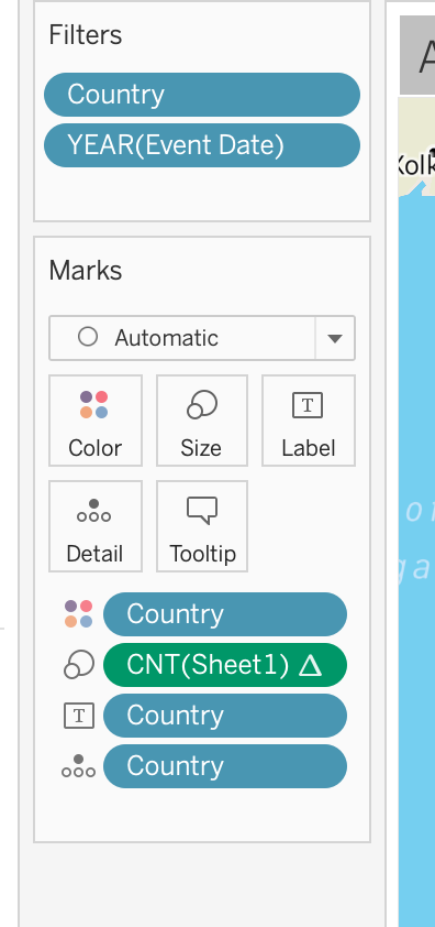
- Create Pie chart for detail information add into Tooltip
- Edit Tooltip and insert the pie chart with the link
- Change the calculation method into Median of Longitude and Latitude for more accurate location, because the location for each country is shifting after I aggregate them.
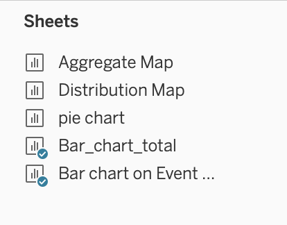
3.1.4 Data Visualization for Bar chart total
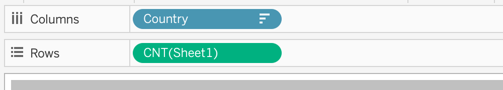
- Drag ‘Country’ into Columns and ‘Count’ into Row
- Create Fliter with Year 2015-2020 and create Country Fliter
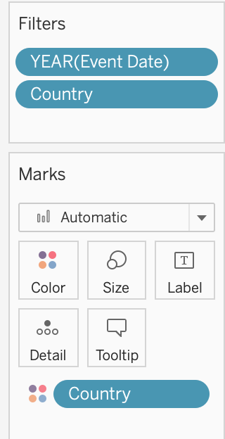
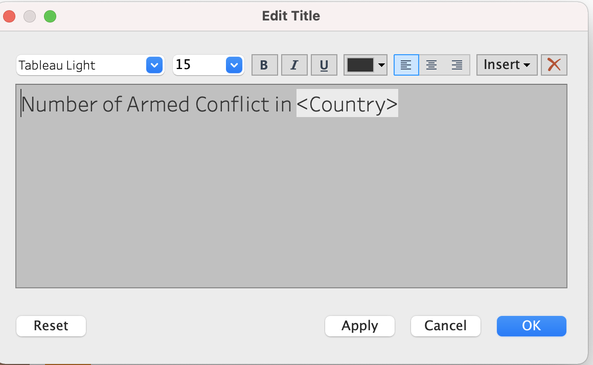
- Create Animation Title with ‘Country’ insert
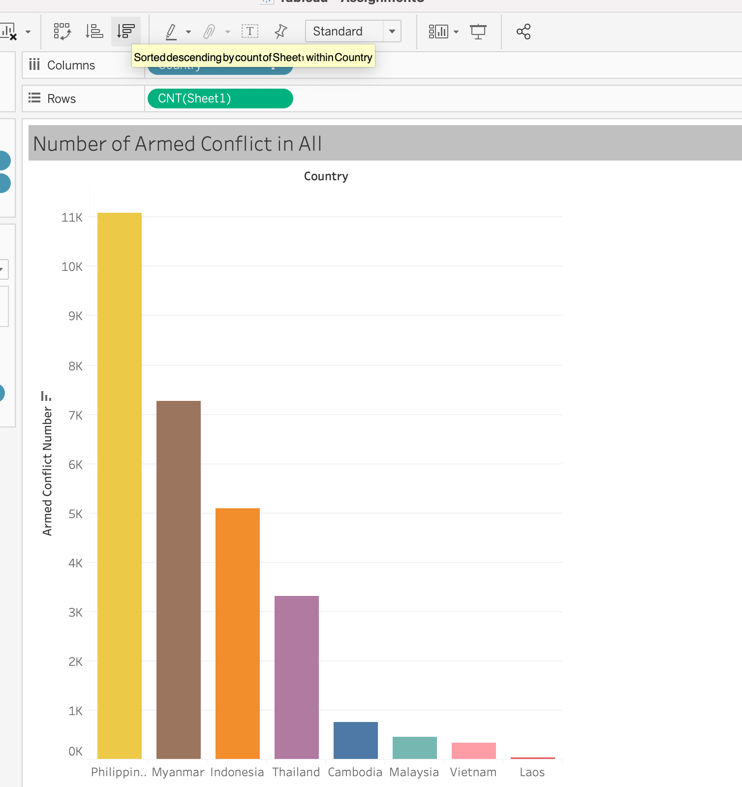
- Sort the bar chart with Descending Order
3.1.5 Data Visualization for ‘Armed Conflict Event by Type’
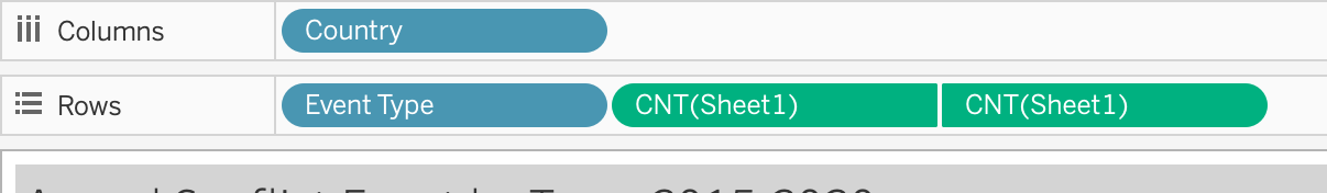
- Drag Country into Columns, drag ‘Event Type’ and ‘Count’ into Rows
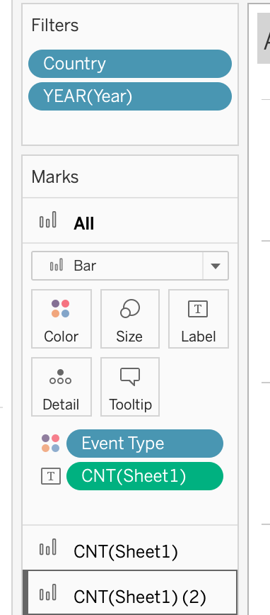
- Create Fliter with Year 2015-2020, create Country fliter, ‘Event type’ on color and ‘Count’ on Label
- Final Result
Dashboard for map
- Drag two maps into one dashboard
- Edit the Title Color:
change the color into light grey for aesthetic
- Add source:
Using Objects > Text > drag to bottom left and add : “Source: The Armed Conflict Location & Events Data Project (https://acleddata.com/#/dashboard)”
Dashboard for bar chart
- Drag two tables into one dashboard
- Edit the Title Color:
change the color into light grey for aesthetic
- Add source:
Using Objects > Text > drag to bottom left and add : “Source: The Armed Conflict Location & Events Data Project (https://acleddata.com/#/dashboard)”
4. Final Visualization
4.1 Snapshot of Dashboard
4.2 Main observations
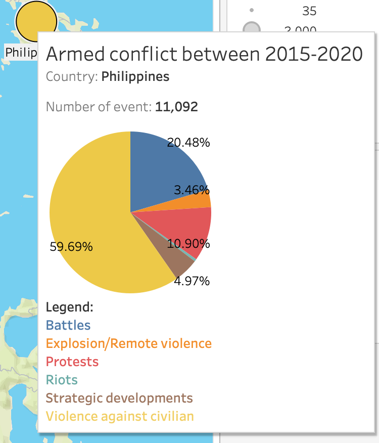
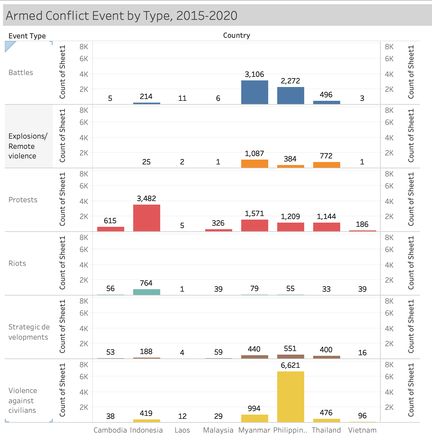
The Philippines has the largest number of armed conflicts, accounting for 11,092, of which Vilence Against Civilian accounts for 59.69%, followed by Battle, which accounts for 20.48%. In second place is Myanmar, of which Battles has the largest of proportion with 41.97%.
Indonesia had the highest number of protests with 3,482. Burma was second with 1,571
As can be seen from the bar chart and the map, LAOS is relatively stable in these eight countries, with 35 cases of armed conflict in total between 2015 and 2020
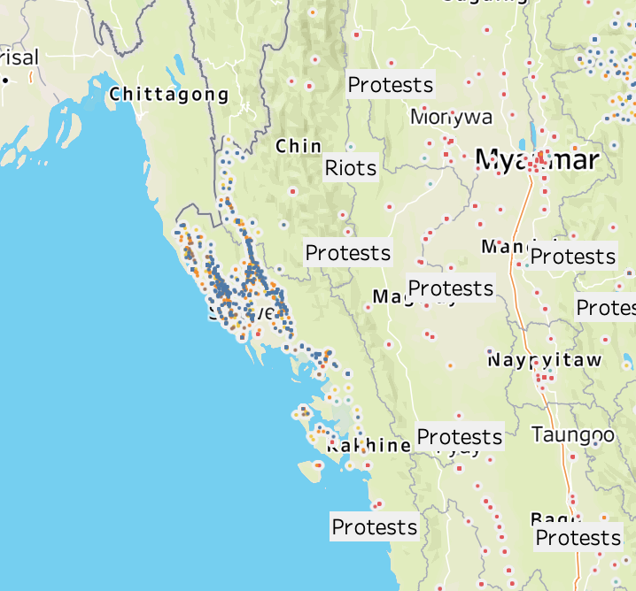
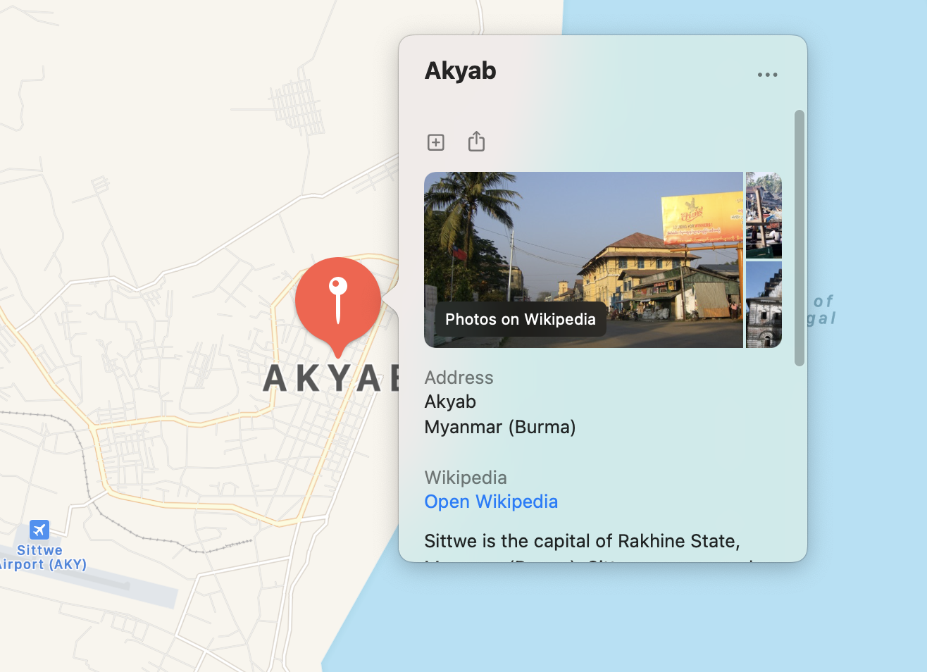
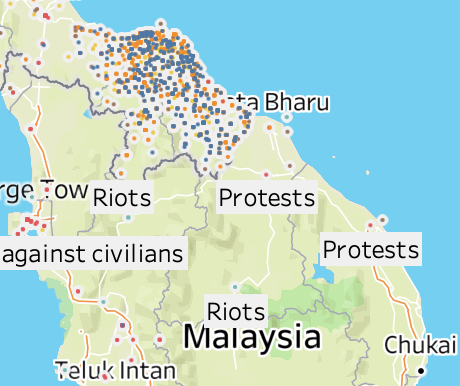
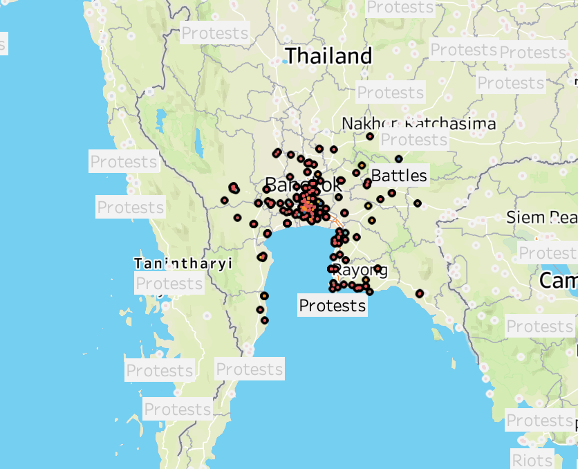
The most density armed conflict part in Malaysia is in Kota Bharu. The most density armed conflict part in Myanmar is Akyab. The most density armed conflict part in Thailand is Bangkok.
- Reference
https://acleddata.com/#/dashboard
https://community.rstudio.com/t/how-to-stack-two-images-horizontally-in-r-markdown/18941