My Blog
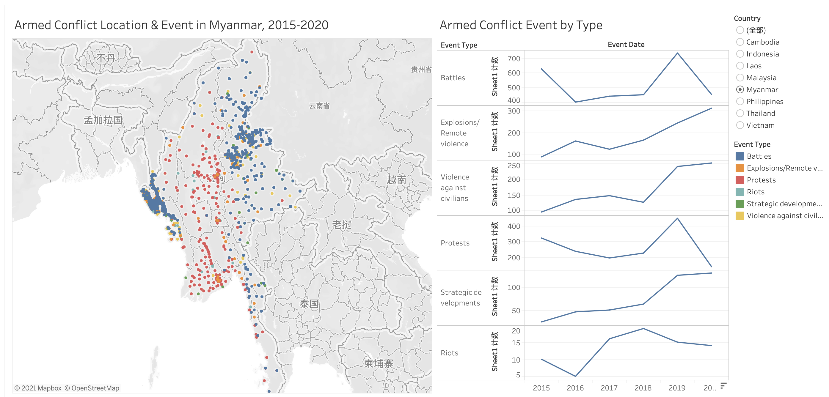
DataViz Makeover 03
South-east Asia Armed Conflict Analysis is a data visualisation created to reveal the spatio-temporal patterns of armed conflict in selected South-east Asia countries between 2015-2020.
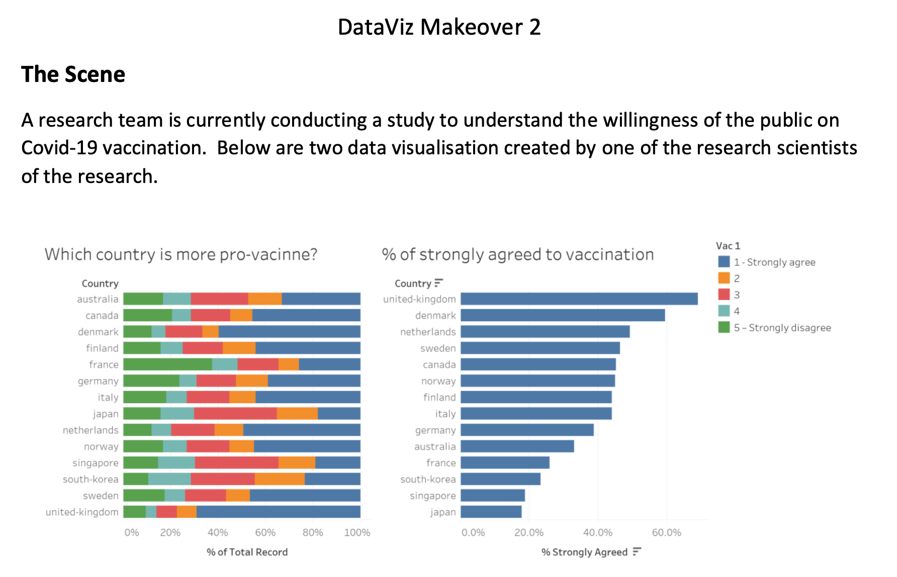
DataViz Makeover 02
This blog is creating a data visualization of public willingness for Covid-19 vaccination. There are two main charts, which I use: Diverging Stacked Bar Charts and Error Bar on a Dot Plot
DataViz Makeover 01
Below is my first DataViz Makeovers assignment. First bar chart is my main chart. Besides, Pyramid and Line chart are for detailed comparison.
Welcome to My Blog
Welcome to my blog, Data Visualization. This blog is present analysis through Tableau and R studio. Hope you are enjoy it!